Project Overview
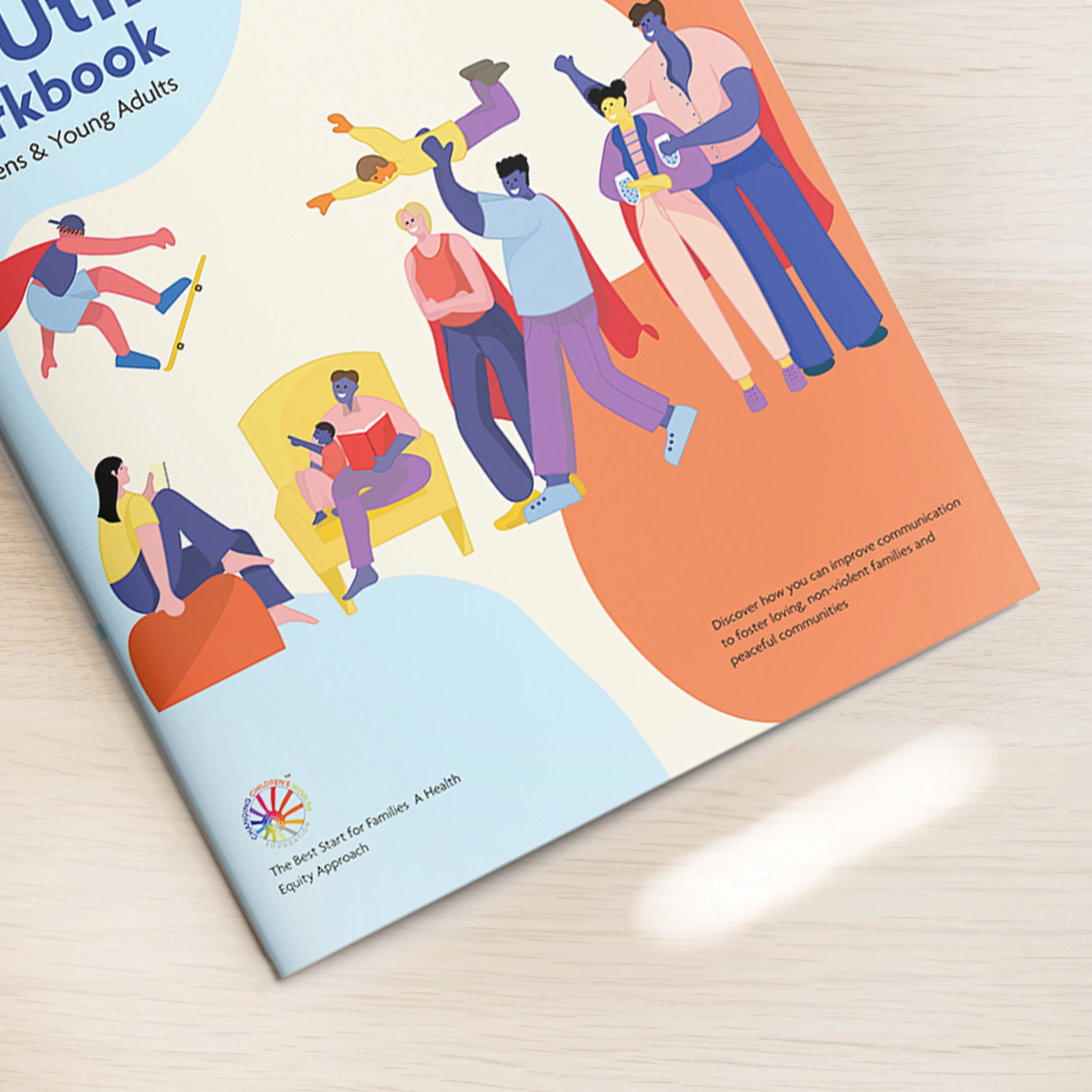
My role as a graphic designer was to create a brand strategy and visual language for CCWF’s All About YOUth program. They wanted to rebrand their youth program with a visual language that is cheerful and uplifting. The question was how to create a brand strategy that reflects values in the book and appeals to the target audience.
Team: Content creator, Executive Director, Education Managers, Web Developer
Target audience: kids and young parents age12 to 24.
Tools: Photoshop, Illustrator, InDesign, Procreate
Methods: Illustration, Prototyping, Branding
Duration: 2 months

Design process
Discovery
Users and their pain points
Define
Illustrations and user flow
Develop
Wireframes and prototypes
Deliver
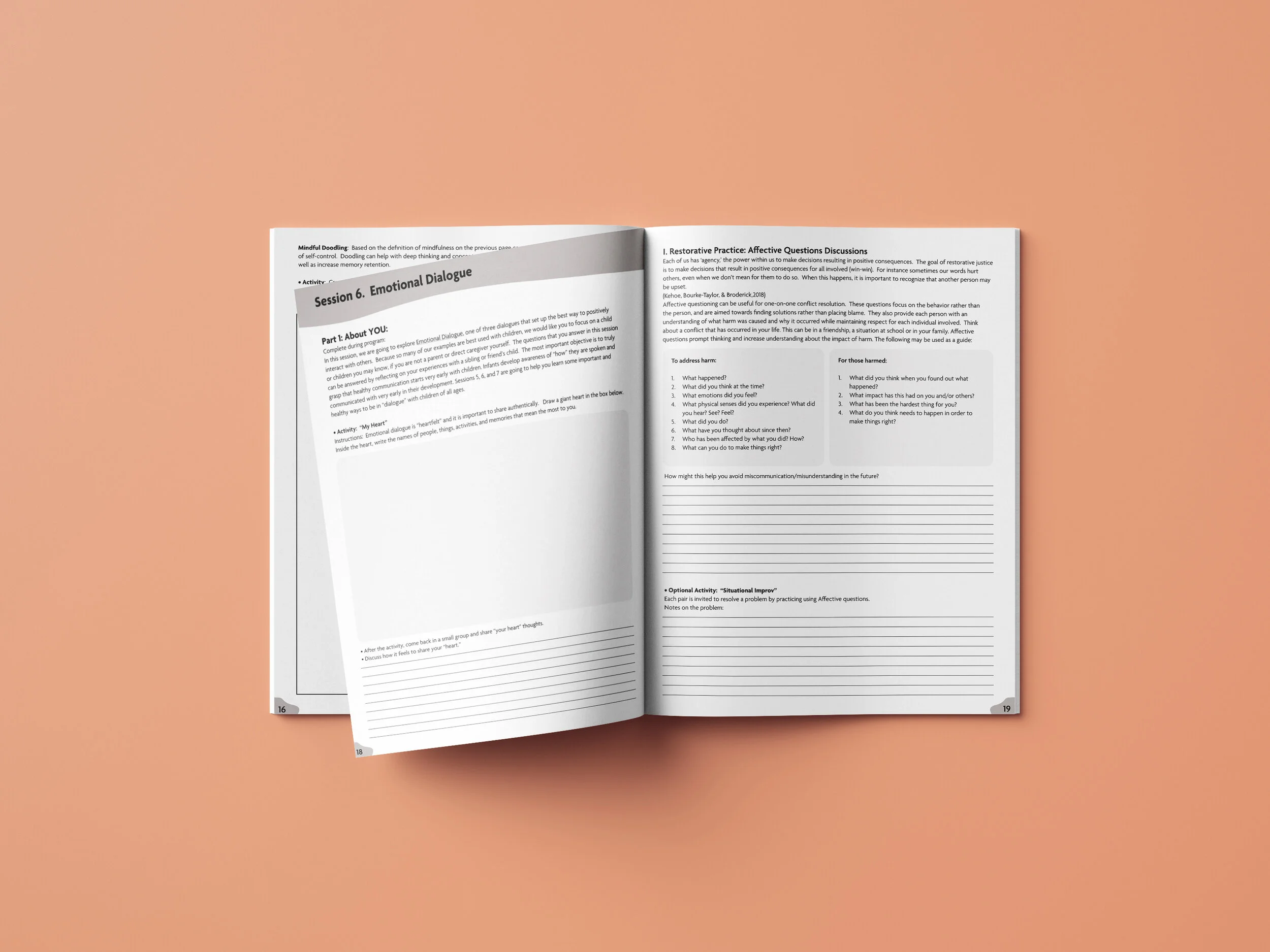
A workbook and website
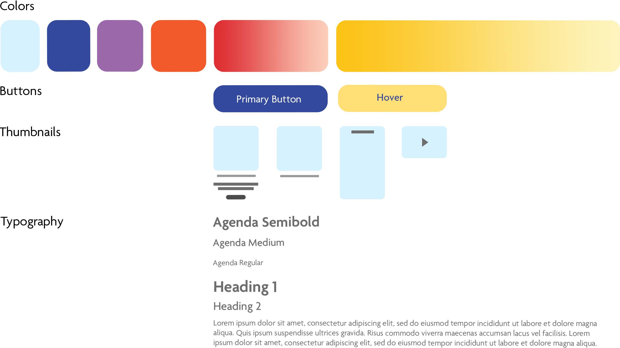
Style Guide
Organic Shapes
The imperfect organic shapes and fluid lines are used in the interface and workbook. These shapes create a sense of approachability and comfort.
Personas
These personas helped discover pain points like legibility and lack of connection. They acted as a guide for illustrations, smooth user flow, and hierarchy in the design.

Outcome

Landing Page
A hero image with playful imagery and a strong headline that leads to a call to action.
All the categories are exposed on the landing page with an intro to the blog section.
About Page
Expresses vision of all about youth program.
A good source for a client to learn about the program and the resources that the blog offers.
Explore page
Made every page consistent with an illustration on the banner image.
The main content is in a blue box brakes up the page and adds consistency to the resource content


